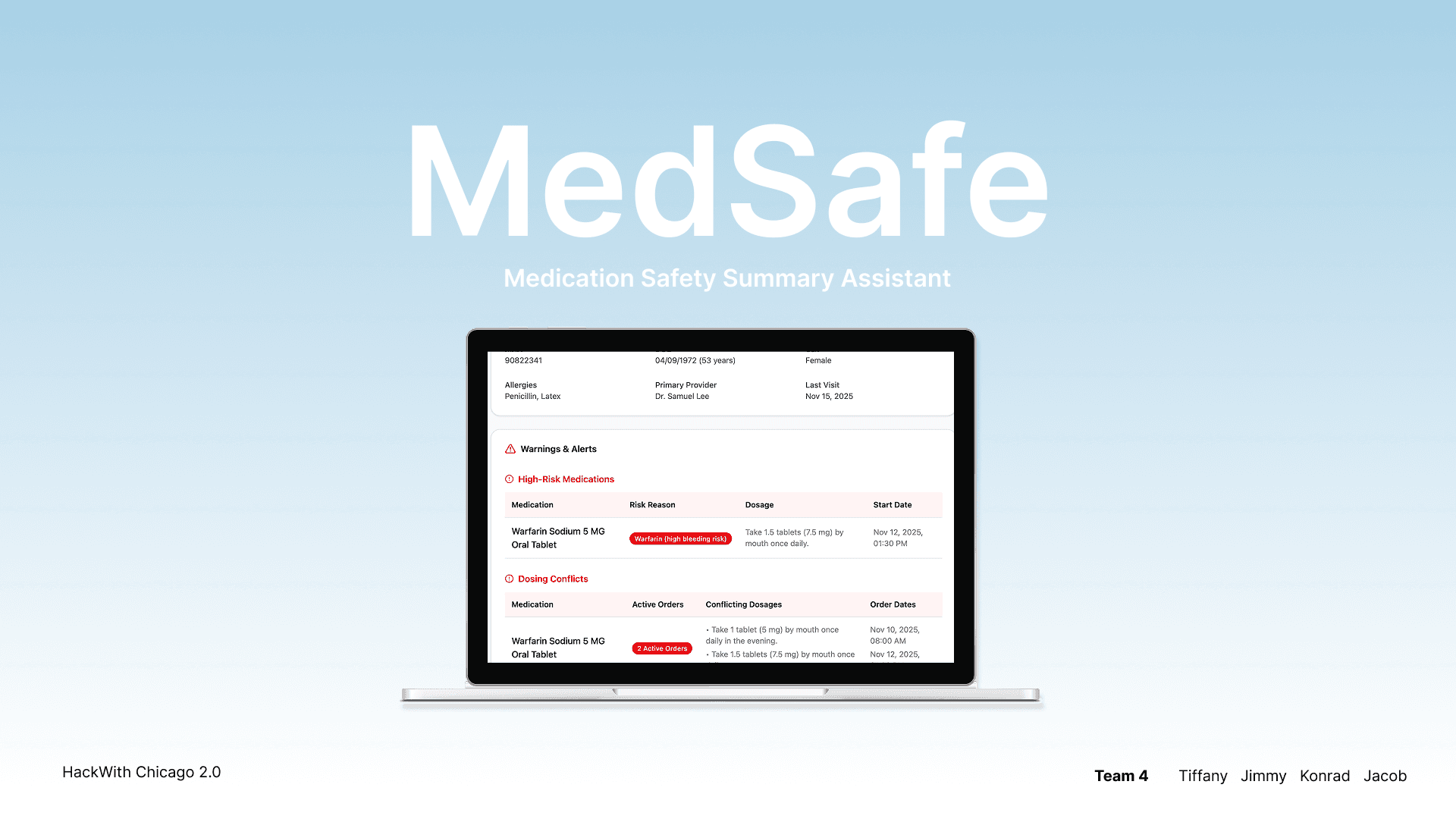
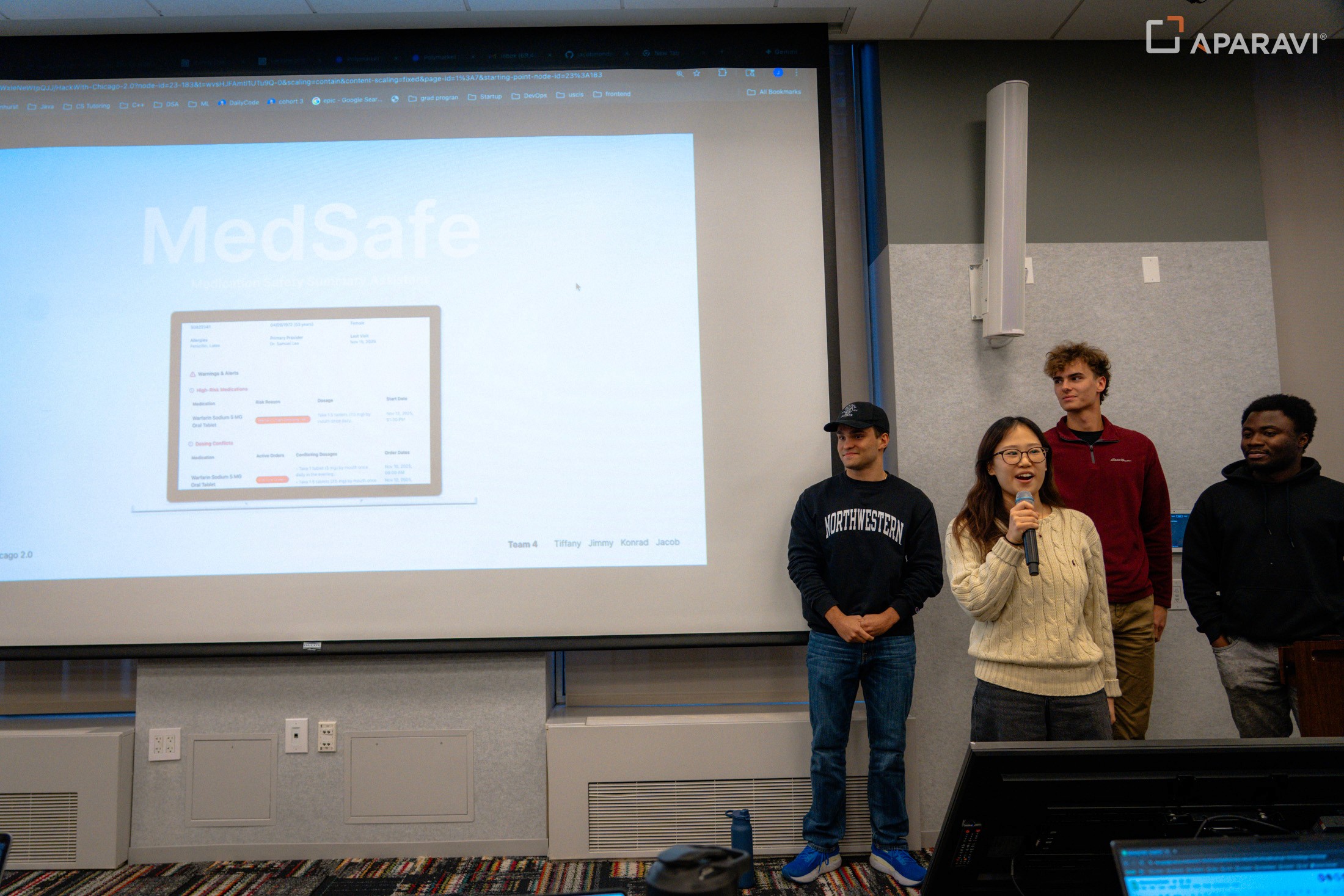
MedSafe
AI-powered dashboard for identifying high-risk medications, missing labs, and dose conflicts
ROLE
Product Designer
TEAM
3 Developers
1 Designer
TIME CONSTRAINT
~6 hours
Tools / Skills
OVERVIEW
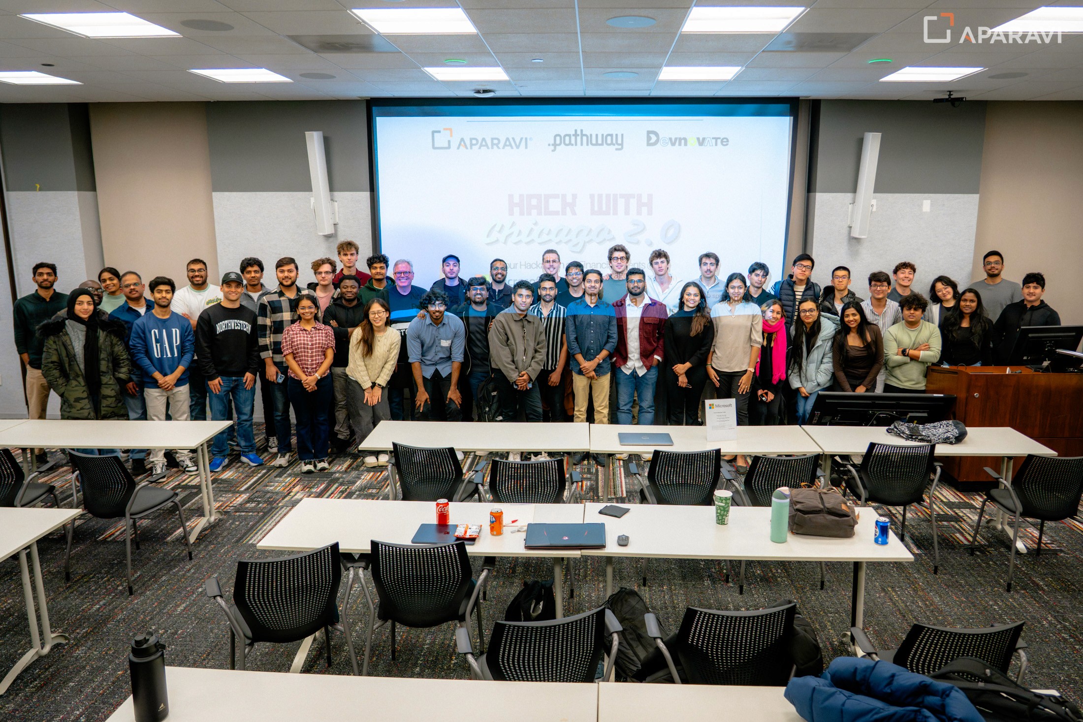
At HackWith Chicago 2.0, our team had 6 hours to design and ship an AI-powered healthcare solution using a provided tech stack.
PROBLEM
60% of hospital medication errors are caused by medication discrepancies.
Pharmacists spend 20–40 minutes per patient piecing together medication lists, lab results, and provider notes across disconnected systems. Critical safety signals like high-risk drugs, missing labs, and dose conflicts are easy to miss, especially during time-sensitive care transitions.
Manual, fragmented, and high-risk.
“None of this is automated. I manually check labs and doctor notes for every high-risk med.”
— Pharmacist (PharmD)
SOLUTION
Dynamic safety dashboard
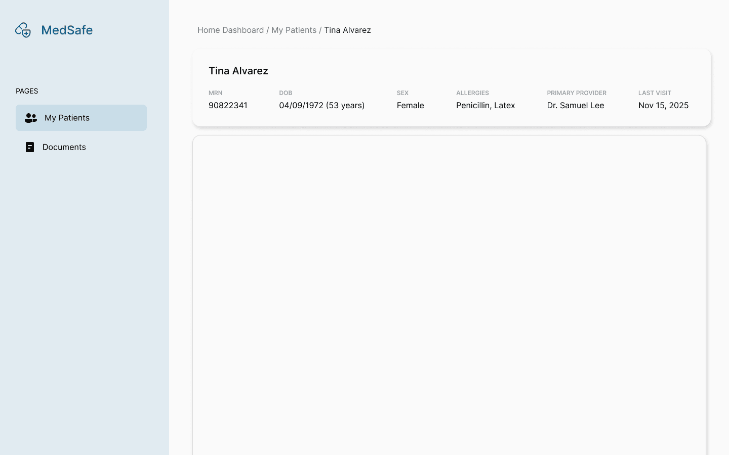
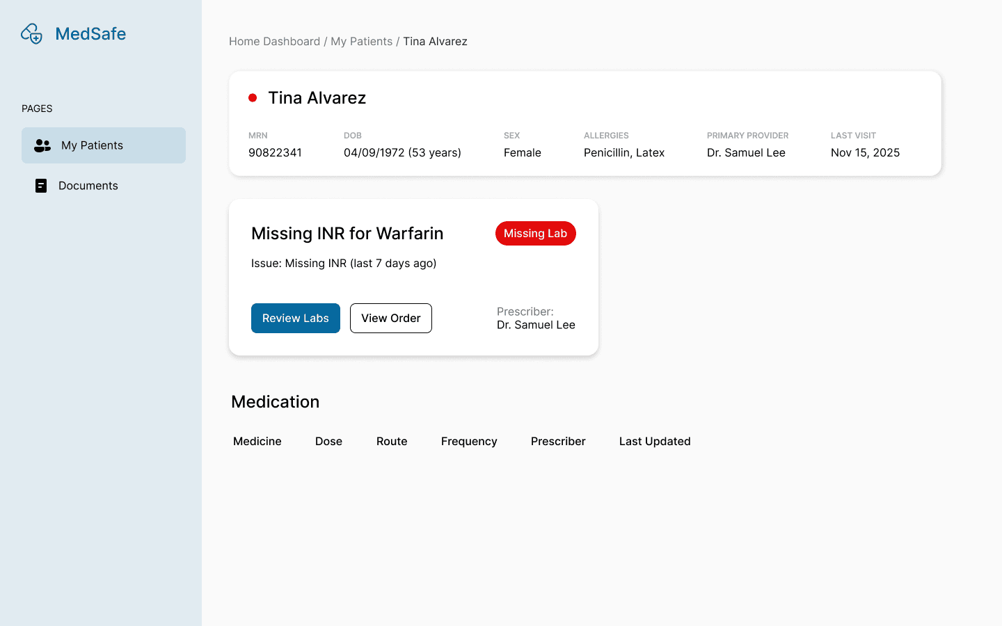
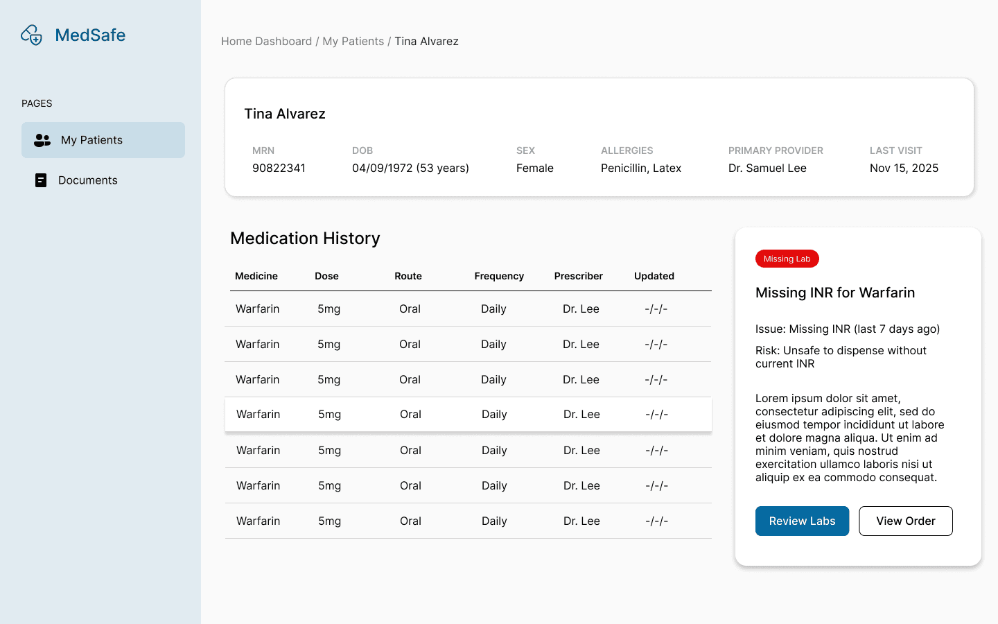
A real time dashboard that brings the most critical medication risks to the front for better visibility.
Using AI to parse and structure messy data, high-risk drugs, missing labs, and conflicting dosages are surfaced immediately with the context needed to understand what’s going on. As new lab data comes in, risk states update dynamically to reflect the latest patient information.
AI surfaces risks, not make clinical decisions.
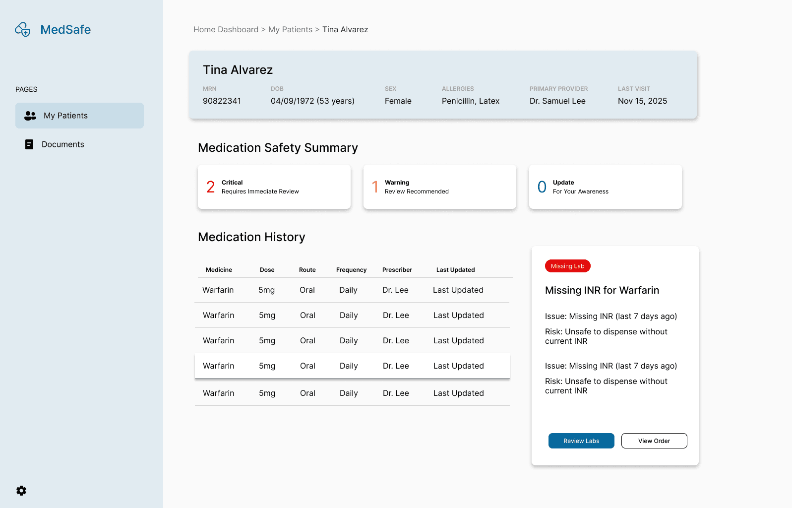
Flags high-risk medications
Detects missing or outdated labs
Identifies dose conflicts across providers
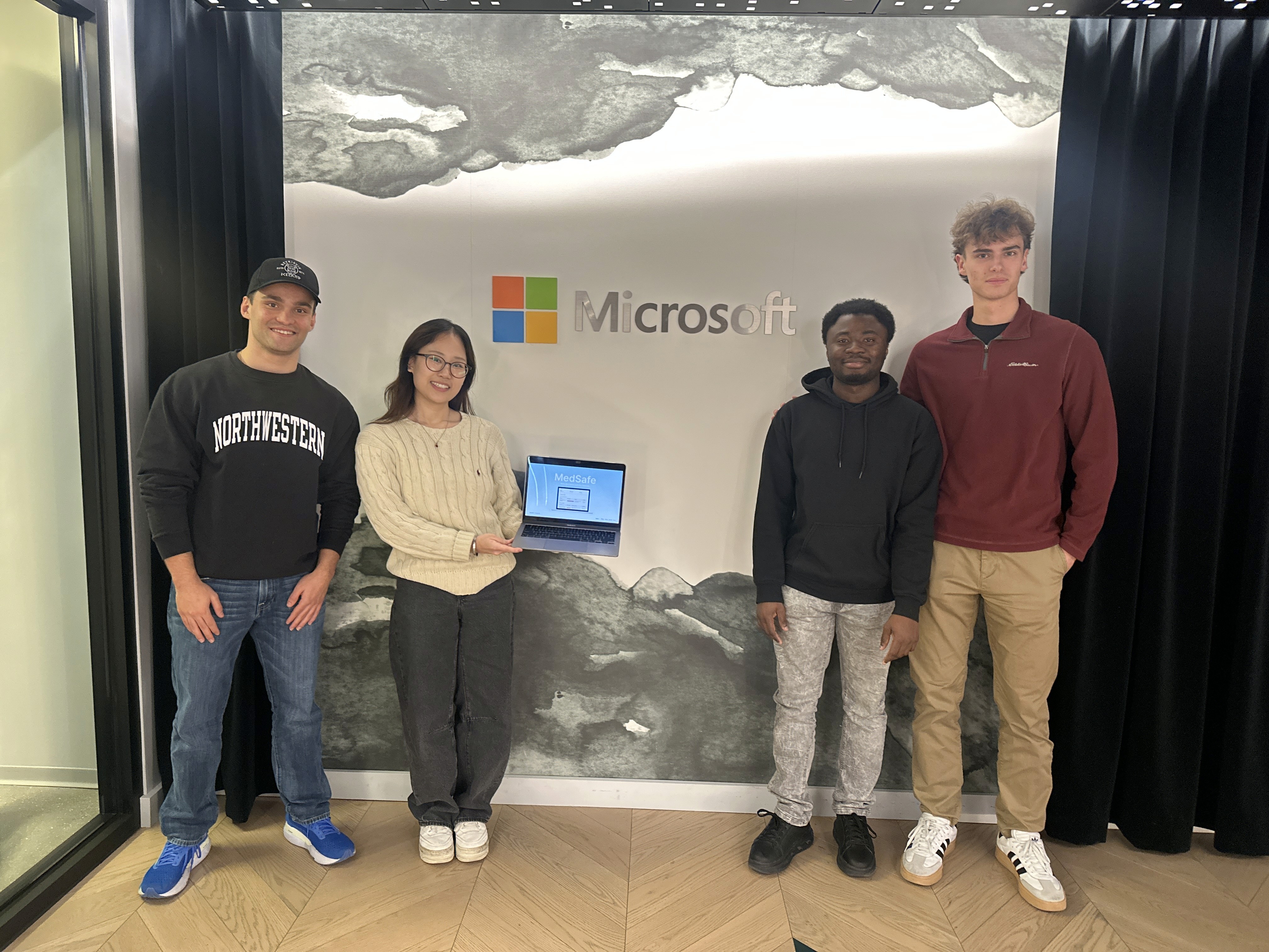
ROLE & EXECUTION
As the sole designer on a team of 3 developers, I led problem framing, scoped the MVP, and translated system logic into a usable interface.
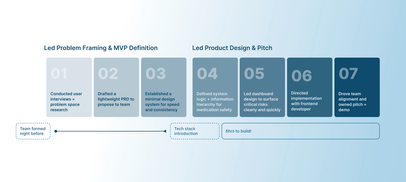
DESIGN DECISIONS
I explored different layouts to balance patient context with risk visibility and focused on a scan-first experience, where the most urgent risks are immediately visible.
Layout Exploration
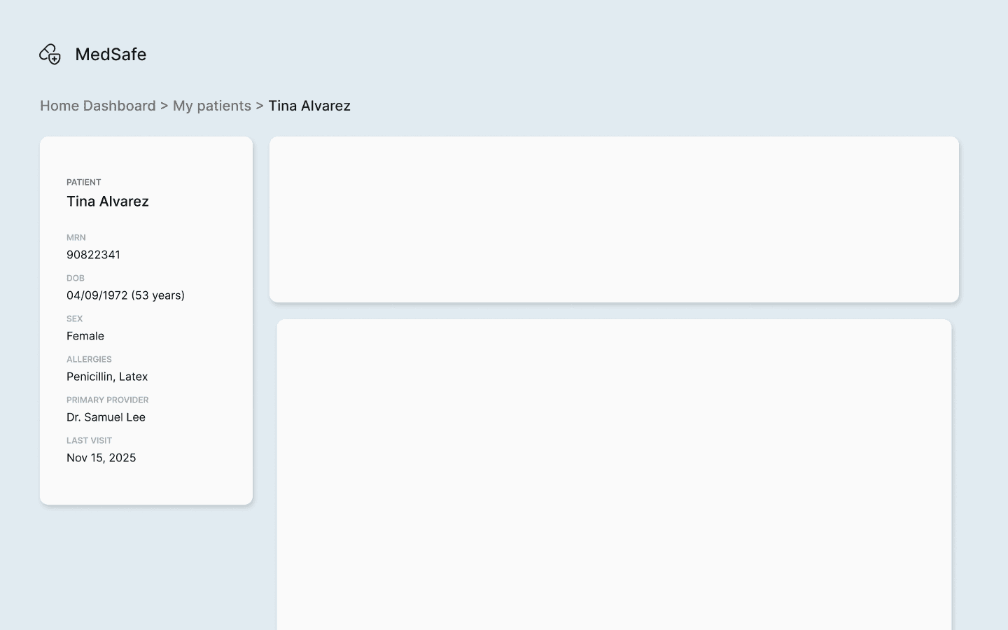
Side panel - keeps patient info always accessible
Top banner - frees up space for alerts and medications
Viewing Critical Information
With limited time, we narrowed the demo to critical alerts only to keep the experience clear and focused.
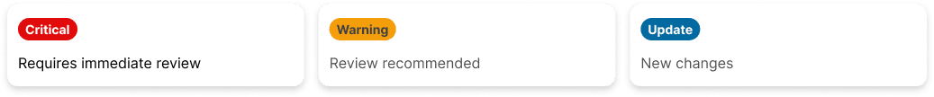
Designed for multiple states (critical, warning, updates)
COLOR PALETTE
Chose a soft blue to create a sense of trust and clarity, while reserving stronger colors for urgent risks
REFLECTION
This hackathon pushed me to move beyond just designing screens and focus on communicating ideas clearly under tight time constraints
KEY TAKEAWAYS
Team Alignment
Setting clear, time-based checkpoints and regularly checking in helped us stay on track and make sure everyone was moving in sync.
Structure > Polish
With limited time, prioritizing information hierarchy mattered more than refining visuals.
Preparation makes a difference
Doing early research and drafting a quick PRD before building helped us align faster and move with more clarity once the hackathon started.
Personal note
This was my first time building alongside engineers in a fast-paced hackathon, and it pushed me to quickly step into an unfamiliar space. I didn’t have prior experience in healthcare, but I enjoyed diving into a new domain and figuring things out through the lens of a real problem.
It reinforced that I’m most energized when I’m learning something new while actively building!